vol. 02 · tier 02 // ch. 09 of 10 · intermediate course
Sector & Macro Context
A great chart in a bad sector is still a coin flip. A great chart in a leading sector during a bullish macro regime is an edge. Always trade with the wind.
- read
- ~7 min
- length
- 1,356 words
- position
- 09 of 10
9. Sector & Macro Context
A great chart in a bad sector is still a coin flip. A great chart in a leading sector during a bullish macro regime is an edge. Always trade with the wind.
The macro stack (top → bottom)
Global liquidity (Fed, ECB, BoJ)
        ↓
Indian liquidity (RBI, repo rate, CRR, bond yields)
        ↓
Currency (USD/INR)
        ↓
Commodity prices (crude, gold, base metals)
        ↓
FII / DII flows
        ↓
Sector rotation
        ↓
Individual stock
Every layer flows down to the next. Big macro shifts overrule small chart patterns.
RBI policy & interest rates
The RBI Monetary Policy Committee (MPC) meets every 2 months. Key levers:
| Tool | Effect on markets |
|---|---|
| Repo rate ↑ | Borrowing costlier → bad for high-debt cos, real estate, autos. Good for banks (NIMs). |
| Repo rate ↓ | Cheap money → bullish for risk assets, especially rate-sensitives. |
| CRR ↑ | Less liquidity → bearish |
| OMO purchases | RBI buying bonds → liquidity injection → bullish |
Watch the 10-year G-Sec yield as a real-time barometer of rate expectations. Yields ↑ → bond prices ↓ → equity multiples compress (especially growth/IT).
US Fed — the global gravity
The US Federal Reserve sets global risk appetite.
- Fed cuts rates / dovish → USD weakens → flows into emerging markets (India benefits) → FII buying.
- Fed hikes / hawkish → USD strengthens → EM outflows → FII selling, INR depreciates.
Watch: FOMC meetings (8/year), CPI/PCE inflation prints, Non-Farm Payrolls (NFP) — all can move Indian markets the next day.
USD/INR
- INR weakening (USDINR ↑) → bad for importers (oil cos, airlines), good for exporters (IT, pharma).
- INR strengthening → opposite.
A 2% INR swing can change quarterly earnings projections meaningfully for IT (TCS, Infy, HCL) and pharma exporters.
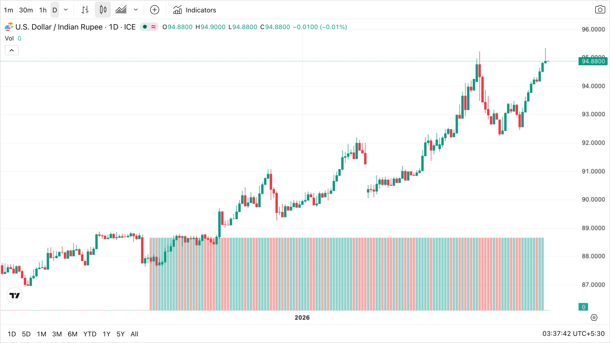
The USD/INR chart almost never goes down meaningfully — it grinds upward over years (INR slowly weakening) with occasional sharp jumps during global risk-off events. Those upward jumps are exactly when importers and high-debt cos start announcing earnings warnings, and exactly when IT and pharma exporters post upside surprises in margins. Use the chart as a sector-tailwind/headwind sniffer: a sharp INR weakening leg = lean toward IT/pharma longs, away from autos/airlines/oil-marketing companies.
Crude oil
India imports ~85% of its crude. Crude price moves cascade:
- Crude ↑ → import bill ↑ → CAD widens → INR weakens, inflation rises → bad for autos, paints, aviation, OMCs (margin compression). Good for upstream (ONGC, Oil India).
- Crude ↓ → opposite.
Brent crude is the global benchmark; WTI is US.
Sector rotation through the cycle
The classic sector clock (rough Indian mapping):
                 Early Recovery
                /              \
   Late Bear                    Mid Bull
  (Defensives)                  (Capex,
   FMCG, Pharma                 Industrials,
   Utilities)                   Materials)
        \                          /
         \                        /
          Bear ←————————————→ Late Bull
        (Cash,                  (Energy,
         Gold)                  Commodities,
                                Real Estate)
                Sideways
              (Pickers' market)
In practice, track sector indices:
| Sector index | Symbol |
|---|---|
| Banking | NIFTY BANK |
| IT | NIFTY IT |
| Auto | NIFTY AUTO |
| Pharma | NIFTY PHARMA |
| FMCG | NIFTY FMCG |
| Metal | NIFTY METAL |
| Realty | NIFTY REALTY |
| Energy | NIFTY ENERGY |
| Financial Services (broader than Bank) | NIFTY FIN SERV |
| PSU Bank | NIFTY PSU BANK |
Rank these by 1-week and 1-month returns vs Nifty 50 every Sunday. Trade longs in the top 3 sectors, shorts in the bottom 3.
FII / DII flows
NSE publishes daily provisional numbers (after-market) and final numbers (next morning).
| Pattern | Interpretation |
|---|---|
| FII buying + DII buying | Strong bullish |
| FII selling + DII buying | DII absorbing — usually bullish but choppy |
| FII buying + DII selling | DIIs taking profits — short-term cautious |
| FII selling + DII selling | Bearish, expect drawdowns |
FII flows are sector-concentrated in financials, IT, energy. A big FII sell day usually hits Bank Nifty harder than other indices.
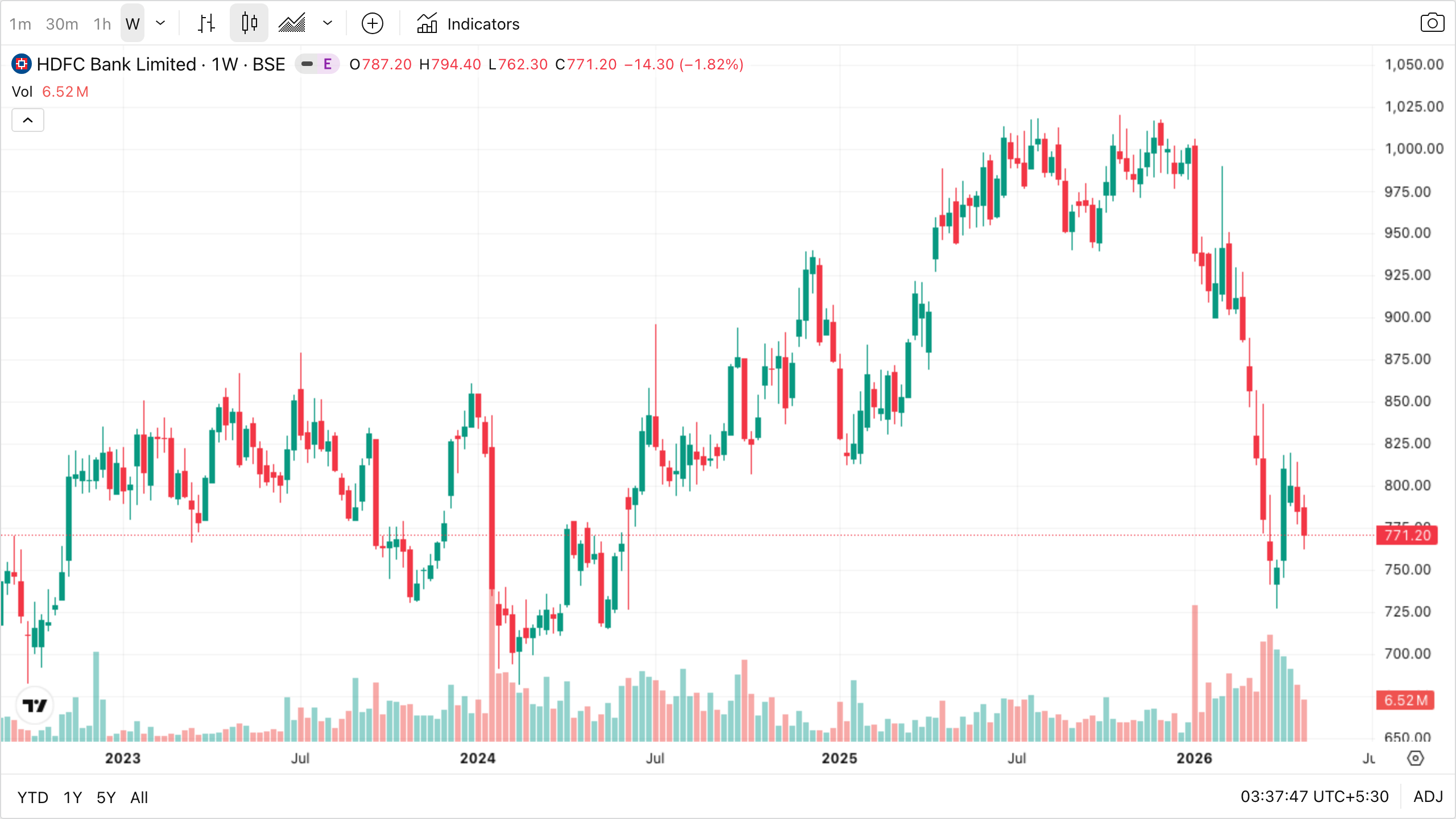
The weekly chart of HDFC Bank above is the single best one-stock proxy for what FIIs are doing in India. Notice the recent sharp breakdown on the right edge of the chart — weeks like that almost always coincide with a string of FII net-sell days on the daily flows sheet, and the broader index suffers in sympathy. When this chart is grinding higher week after week, FIIs are typically net buyers and longs in any large-cap have a tailwind. Trader’s habit: when you’ve identified a long setup in any Indian large-cap, glance at this chart first. If it’s bleeding (as it is at the right edge), the macro tide is against you and even good setups get washed out.
Earnings season
Quarterly results window: mid-Jan, mid-Apr, mid-Jul, mid-Oct (results for Dec/Mar/Jun/Sep quarters).
Effect on markets:
- Volatility spikes in individual stocks (15–25% intraday moves common).
- IV spikes in F&O — option premiums fat → expensive to buy.
- Pre-result trades are essentially binary bets — treat as such.
- Post-result trades (after the gap is digested) often have better R:R — wait for confirmation.
Track earnings calendars on Trendlyne, Moneycontrol, NSE.
Key economic data releases
| Release | Frequency | Why it matters |
|---|---|---|
| CPI / WPI inflation | Monthly (12th, 14th of month) | Determines RBI rate path |
| GDP | Quarterly | Macro health |
| IIP (industrial production) | Monthly | Manufacturing pulse |
| PMI (Mfg + Services) | Monthly (1st, 3rd) | Forward-looking activity |
| Trade deficit | Monthly | Currency pressure |
| Fed FOMC | 8/year | Global risk-on/off |
| Budget (Feb 1) | Annual | Sector winners/losers |
| RBI MPC | Every 2 months | Rates, liquidity |
Mark these on your calendar. Reduce position size or stay flat on big release days.
Geopolitical & event risk
Things that move markets unpredictably:
- Wars, sanctions
- Oil shocks (OPEC+ decisions)
- Election results (Indian Lok Sabha, US Presidential)
- Major IPO / LIC-style listings
- China / EM contagion events
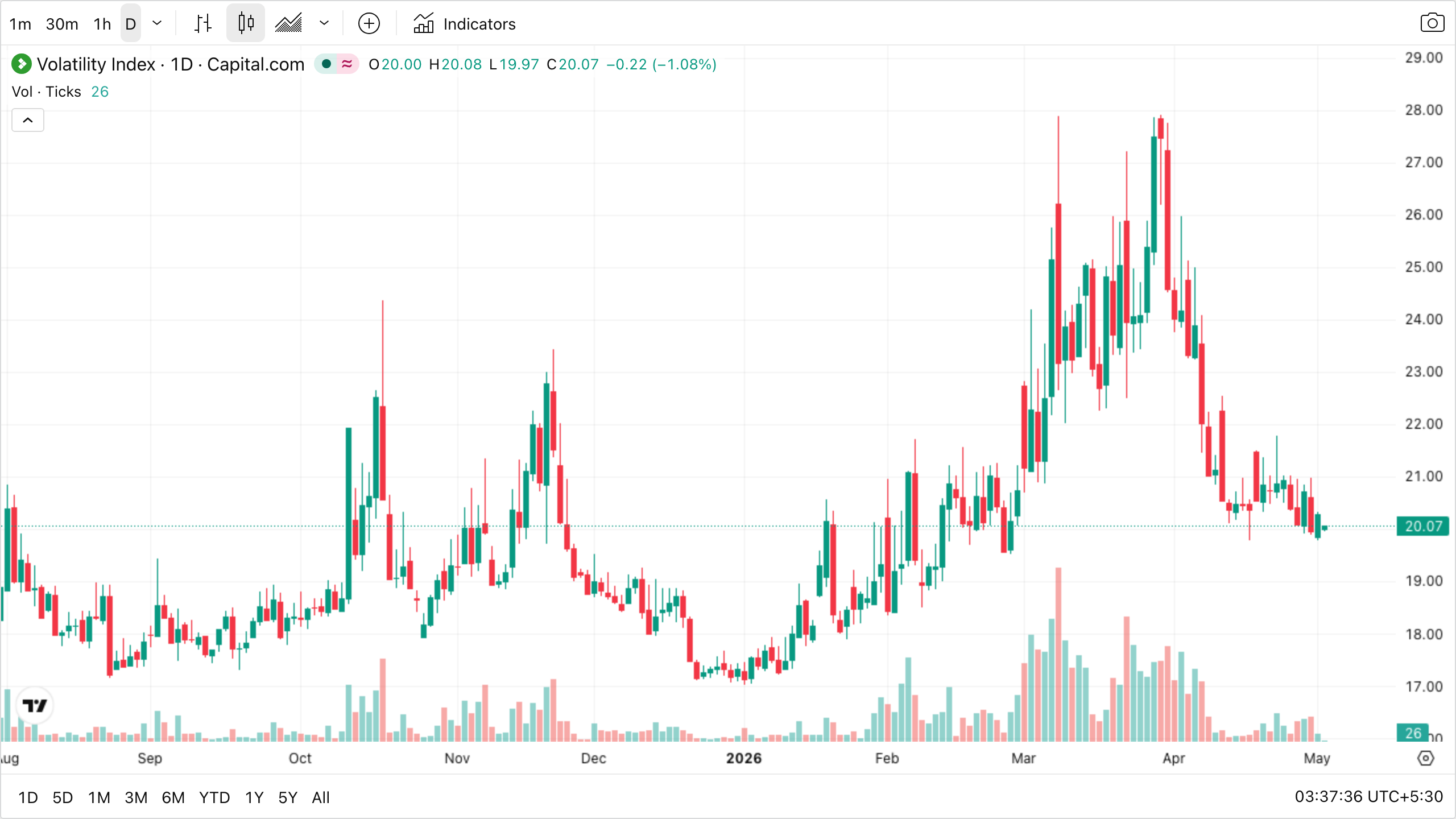
Look at the chart’s shape: long stretches of low, boring values punctuated by occasional violent vertical spikes that fade back down within days or weeks. That asymmetric profile is the defining behaviour of every volatility index globally — India VIX, US VIX, Europe’s VSTOXX all look like this. The takeaway for traders: vol spikes are events to be sold; low-vol stretches are the times when you should be quietly buying tail-protection insurance, because that protection is dirt cheap and you’ll need it when the next spike inevitably arrives. The trick is doing the boring thing during the calm, not waiting until the spike forces it on you in panic.
(US VIX shown as a proxy. India VIX behaves identically; data on TradingView requires a free login — search for NSE:INDIAVIX.)
You can’t predict these — but you can size down before known event risk, and have a shock plan (how you’ll act if Nifty gaps −5%).
Putting it together — top-down trade idea
You see Tata Steel forming a bullish flag on the daily.
Before entering, the macro check:
- Global: Fed signaling cuts, USD weakening. ✅
- India: RBI on hold, liquidity neutral. ✅
- Currency: INR stable. ✅
- Commodity: Steel prices firming on China stimulus. ✅✅
- Sector: Nifty Metal up 8% in last 30 days, beating Nifty by 5%. ✅✅
- FII: Net buyers 4 of last 5 days. ✅
- Stock: Bullish flag, RS rating 87, above 200 SMA. ✅
This is a high-conviction trade. Macro, sector, and chart all aligned. Take it with normal size.
Now flip the macro: imagine crude is spiking, INR weakening, FIIs selling heavily, metal sector down 6%. Same chart, but skip the trade. The wind is against you.